
Case Studies in Urban Transit |
INTRODUCTION
The Subway That Built a City
New York never does anything quietly. When the city opened its first subway line on 27th October 1904, it did so with a crowd of dignitaries, a mayoral ceremony at City Hall, and a train that within hours was hauling more passengers than anyone had dared plan for. The subway was not built for the city that existed in 1904. It was built for the city that New York intended to become.
That ambition, reckless, magnificent, and perpetually outrunning its own infrastructure, is the defining characteristic of the New York subway, and it has shaped everything about the system: its engineering, its chaos, its art, and the maps that have tried, with varying success, to make sense of it all.
What follows is the story of how the world’s most populous and contested underground railway came to be, and how it became not merely a transport network but a cultural institution, a canvas, and an icon that has embedded itself in the imagination of a city that never sleeps.
EPISODE 01
Why New York Needed to Go Underground
The crisis of the surface city and the birth of the IRT
A City Choking on Its Own Success
By the final decade of the nineteenth century, Manhattan was in crisis. The island’s streets, laid out in the great grid plan of 1811, had been designed for a city of a few hundred thousand. By 1890, Manhattan alone held over a million and a half people, crowded into tenements, crossing avenues thick with horse-drawn vehicles, elevated railways, and pedestrian traffic so dense that movement through the commercial districts had slowed to a crawl.
The elevated railways, the ‘Els’, had been built from the 1870s onward as Manhattan’s first solution to the transit problem, running on iron trestles above Second, Third, Sixth, and Ninth Avenues. They were noisy, dirty, and dangerous; they plunged the streets beneath them into shadow, dropped hot ash and oil on pedestrians below, and rattled the windows of the tenements they flanked. They also worked, after a fashion, and their ridership in the 1890s ran into the hundreds of millions annually. But they could not keep pace with growth. The city was expanding northward into upper Manhattan and outward into Brooklyn, Queens, and the Bronx, and the elevated lines could not follow fast enough.
The solution being proposed in engineering circles, and in the pages of newspapers that grew increasingly shrill about the transit crisis, was a railway below ground. London had demonstrated the principle since 1863; Budapest had opened its small underground line in 1896; Boston had just opened a short subway tunnel in 1897. New York, the argument ran, could and should go further.
| “ The subway was not built for the city that existed in 1904. It was built for the city that New York intended to become. — New York Transit Museum, 2001 |
Politics, Money, and the Rapid Transit Act
The politics of building the subway were byzantine even by New York standards. The central tension was between public ownership and private operation. Reformers insisted that a publicly owned rapid transit system was essential to democratic governance of the city; the financial community argued that private capital was the only realistic source of the funds needed for construction.
The resolution came in stages. The Rapid Transit Act of 1894 created the Board of Rapid Transit Railroad Commissioners, empowered to plan and contract for a subway. After years of negotiation, and the spectacular collapse of an earlier concession, the Board awarded a contract in 1900 to August Belmont Jr., the banker and financier who became the dominant figure in the subway’s early history. Belmont formed the Interborough Rapid Transit Company (IRT) and signed a contract that gave the city ownership of the infrastructure while the IRT operated the system under a long-term lease.
Construction began in March 1900. The chief engineer was William Barclay Parsons, and the contractor was John B. McDonald. They faced a problem that London’s early subway builders had not: unlike London, where the clay geology made deep tunnel boring relatively straightforward, Manhattan’s bedrock geology varied wildly, ranging from solid schist that required blasting to loose sand and gravel that threatened to collapse into any excavation.
Cut-and-Cover and the Manhattan Bedrock
The engineering solution adopted for most of the original IRT was cut-and-cover construction: dig a trench, build the tunnel structure within it, and replace the surface above. It was disruptive, slow, and enormously expensive in a city as dense as Manhattan, but it was faster and cheaper than deep-bore tunnelling and more reliable given the geological variability.
Where the rock was solid, in the upper sections of the line, as it ran toward the Bronx, the tunnels were cut directly into the schist, producing stations of considerable grandeur. Where the geology was less cooperative, steel and concrete structures were built within excavated trenches and then buried. The result was a line that ran at varying depths and through tunnels of varying character, a physical heterogeneity that would come to define the New York subway’s distinctive identity.
| THE IRT IN NUMBERS — 1904 |
| Opening date: 27th October 1904 |
| Original route length: 9.1 miles (14.6 km) |
| Stations: 28 |
| First-day ridership: 150,000 passengers |
| Construction cost: $35 million (approx. $1.1 billion today) |
| Tunnel method: Cut-and-cover, with some open cut and rock tunnel |
| Maximum design speed: 45 mph (72 km/h) |
EPISODE 02
Engineering Constraints
How geology, money, and politics shaped the tunnels beneath New York
Three Systems, One City
The IRT was not the only subway system that would be built under New York. Dissatisfied with Belmont’s monopoly on rapid transit, the city eventually authorised two further networks: the Brooklyn-Manhattan Transit Corporation (BMT), which incorporated earlier elevated and tunnel railways in Brooklyn and expanded them into Manhattan; and the Independent Subway System (IND), which the city built and operated itself beginning in 1932.
The result was three incompatible systems sharing the same city. Incompatible is not a metaphor: the IRT’s tunnels were built to a narrower gauge and smaller car width than those of the BMT and IND. IRT trains cannot run on BMT or IND tracks, and vice versa. This engineering incompatibility, a product of the piecemeal, politically fragmented manner in which the subway was built, has constrained the system ever since. When the city unified the three systems under a single operator in 1940, it inherited not a coherent network but a confederation of three distinct railways sharing a common fare.
The Geology Problem
Manhattan’s geology is a palimpsest of Ice Age deposits and ancient bedrock, and building underneath it required constant improvisation. The schist that underlies midtown Manhattan made construction in that zone relatively straightforward once the excavations reached solid rock. But in lower Manhattan, where landfill had extended the island’s footprint into the surrounding rivers, the ground was waterlogged and unstable, requiring compressed air working methods and constant pumping.
The East River crossings presented particular challenges. The tubes that carry the subway between Manhattan and Brooklyn, Queens, and the Bronx run through cast-iron or steel tubes driven through the riverbed, a technology pioneered in earlier river crossings elsewhere but here applied at unprecedented scale. Working in compressed air, in tunnels far below the river surface, cost-tunnel workers their health and sometimes their lives; decompression sickness (the bends) was a constant hazard.
The Steinway Tunnel, which carries the 7 line under the East River from Manhattan to Queens, was one of the most challenging of these crossings. Begun in 1892 as a planned streetcar tunnel and eventually repurposed for subway use, it ran through particularly difficult ground and required a cofferdam and compressed-air methods that pushed the engineering of the time to its limits.
| “ Three incompatible systems, one city. The subway’s greatest engineering constraint was not geology, it was politics. |
Capacity, Overcrowding, and the Design of Rush Hour
From its opening day, the New York subway operated at or beyond its designed capacity. The IRT’s original trains were built for a comfortable load; within months, the crush of passengers during rush hours had made comfort an irrelevant category. This overcrowding was not a failure of planning but a consequence of success: the subway made distant neighbourhoods accessible, encouraging precisely the population growth and density that then overwhelmed the system.
The response, characteristically, was expansion. New lines were built, existing ones were extended, and the system grew through a succession of Dual Contracts (1913), IND construction (1932 onward), and incremental additions that continued through the twentieth century. The capacity problem was never definitively solved, New York’s subway has operated in a state of chronic overcrowding for most of its history, but it was managed, extended, and endured, becoming part of the city’s identity rather than a problem to be fixed.
The physical consequence of this relentless expansion is a network of extraordinary complexity: 472 stations, 245 route miles, 26 lines, and a tangle of express and local tracks, skip-stop services, and shared infrastructure that is unlike any other subway system in the world. Navigating it has always required something more than a map. It has required local knowledge, experience, and a particular kind of New York stubbornness.
The 24-Hour Imperative
No other major metro system in the world runs continuously, around the clock, every day of the year. This single operational fact has profound engineering consequences. In London, Paris, Tokyo, and virtually every other city with an underground railway, the nightly closure gives engineers time to maintain tracks, replace components, and carry out works that are impossible on a live railway. New York’s never-closing system must be maintained on the fly, often with workers on the tracks in windows between trains measured in minutes rather than hours.
The 24-hour imperative has made the New York subway physically different from its peers. Maintenance is harder; renewal is slower; the infrastructure ages unevenly, with some sections in excellent condition and others, particularly the older elevated sections in outer boroughs, in a state of chronic deterioration. The great crisis of the 1970s and 1980s, when the system teetered on the edge of collapse as the city’s fiscal position imploded, was not merely a funding problem: it was a consequence of decades of inadequate maintenance on an infrastructure that could never be stopped for repairs.
EPISODE 03
Map Design Philosophy
From chaos to standardisation — and back
The Pre-Modern Era: Every Man for Himself
For much of the subway’s early history, there was no single authoritative map of the system. The three separate companies, IRT, BMT, and IND, each produced their own cartography, with no particular incentive to help passengers navigate the others’ lines. Station signage was inconsistent, platform maps were rare, and the advice most frequently offered to confused passengers was to ask a fellow traveller. New Yorkers became expert in the oral transmission of subway knowledge: which train to take from where, which express stops where, which platform to use for the uptown or downtown service.
After unification in 1940, the newly consolidated New York City Transit Authority (eventually absorbed into the Metropolitan Transportation Authority) began to grapple with the problem of system-wide mapping. The maps produced in the 1940s and 1950s were geographically accurate but deeply cluttered, attempts to represent the entire system, with its labyrinthine route structure, on a single sheet produced images of bewildering complexity that were difficult to read even in good light and virtually impossible under the fluorescent glare of a station platform.
Vignelli and the Beck Moment
The solution came, or seemed to come, from an unexpected direction. In the early 1970s, the MTA commissioned the design firm Unimark International to redesign the subway’s signage and map system. The project was led by Massimo Vignelli, the Italian designer whose work across advertising, furniture, and graphic design had established him as one of the defining figures of modernist design. Vignelli was, by temperament and training, a devotee of the principles that Harry Beck had pioneered in London: clarity, reduction, the suppression of irrelevant geographical information.
The map Vignelli produced in 1972 was, by almost any design measure, superb. Its lines were clean, its colour coding logical, its typography, Helvetica, used with the discipline for which Vignelli was famous, exemplary. Geographic distortions were accepted without apology: Central Park was shown as a perfect square, the boroughs were compressed or expanded as the diagram required, and the relationship between the map and the actual surface of the city was, frankly, loose.
It was also, for a significant proportion of New York’s riders, incomprehensible. Complaints flooded in. The map, critics argued, didn’t look like New York. Neighbourhoods were unrecognisable. The distortions that Beck’s London riders had accepted, because they had already learnt to think of the Underground as a world apart, were rejected by New Yorkers, who used the subway in immediate dialogue with the street grid above them. You got off a subway stop and you needed to know which way was uptown, which was downtown, whether you were east or west of your destination.
| “ Vignelli’s map was, by almost any design measure, superb. It was also, for a significant portion of New York’s riders, incomprehensible. |
The Hertz Map and the Return to Geography
The Vignelli map was withdrawn in 1979 and replaced by a geographically accurate design produced by John Tauranac and Michael Hertz Associates. Where Vignelli had imposed system on the city, Hertz restored the city to the map. Streets, parks, waterfronts, and landmarks appeared. The boroughs were shown in roughly their correct proportions. The map was, by comparison with Vignelli’s, cluttered and inelegant; it was also immediately legible to anyone who knew New York’s street layout.
The Hertz map became the standard, and its basic approach, geographic accuracy, surface landmarks, borough differentiation, has informed every subsequent official MTA map. Periodic redesigns have refined the typography, adjusted the colour coding, and incorporated new lines and stations, but the fundamental commitment to geographical orientation has not wavered.
The Vignelli episode remains a touchstone in design discussions about maps, cities, and the relationship between abstraction and usability. Vignelli himself was unrepentant, dismissing the complaints as evidence of the public’s failure to understand good design. Whether this was confidence or arrogance, and design historians continue to disagrees, the episode demonstrated that a map is not purely a design object. It is a social one, and its success depends on the expectations and habits of the people who use it.
The MTA Map Today
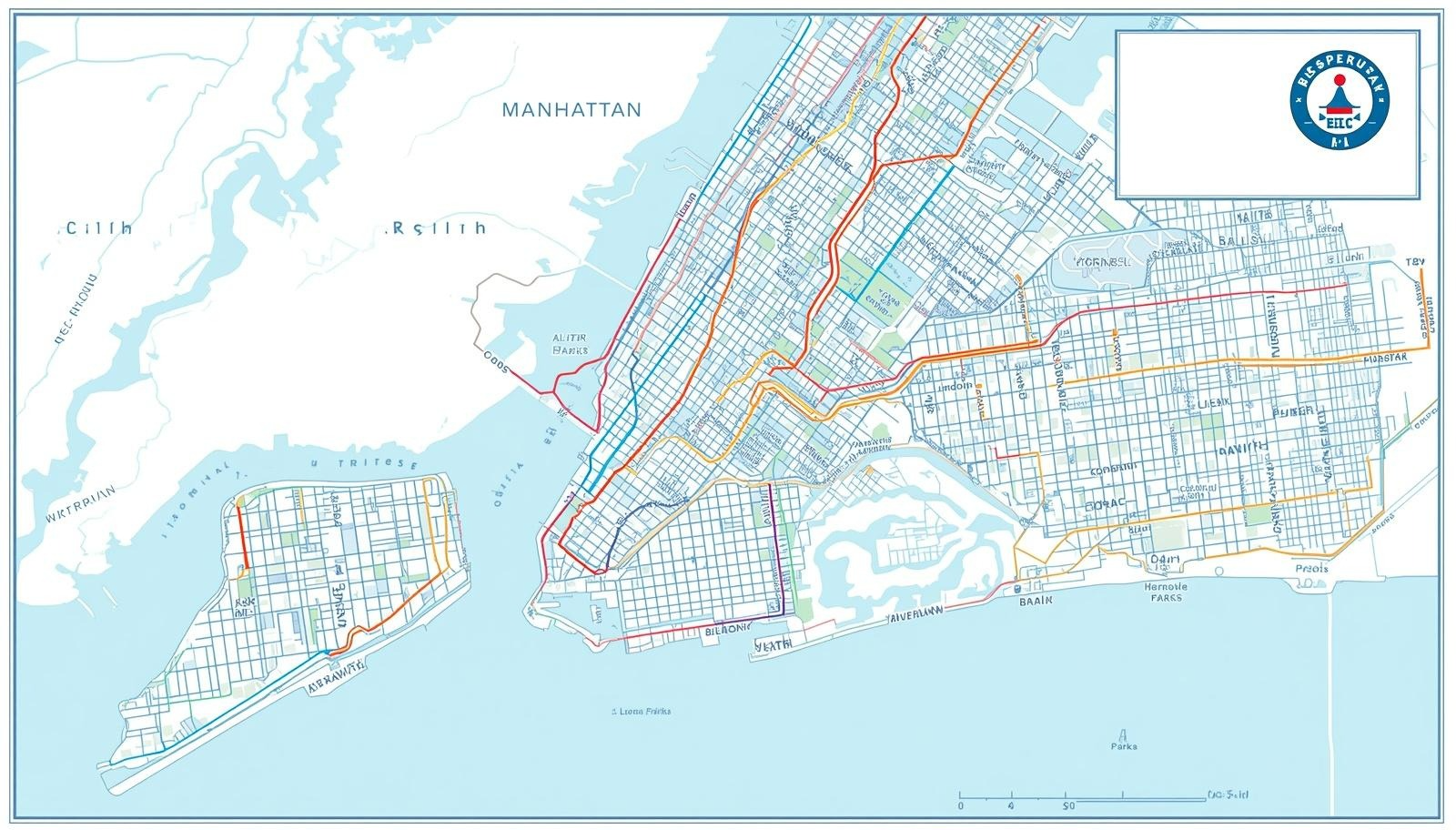
The current official MTA subway map is a lineal descendant of the Hertz design. It shows the borough outlines, the major parks and waterfronts, and a simplified street grid for Manhattan. It uses colour coding for lines and distinctive bullet symbols, the circular route identifiers that have become among the most recognisable design elements of the New York transit system. The bullet symbols, the coloured circles containing route letters and numbers, were introduced in the Vignelli era and survived the map’s redesign, becoming the system’s primary visual identity.
The map has been supplemented, in the digital era, by interactive online versions, smartphone apps, and real-time service alert systems that address the static map’s greatest weakness: its inability to reflect the complex pattern of service changes, closures, and diversions that characterises New York subway operations on any given weekend. The gap between the official map and the actual service being run at any given moment is itself a New York institution, source of exasperation, dark humour, and the particular solidarity of shared suffering that characterises the New York commuter.
EPISODE 04
Branding, Art & Iconography
Tile mosaics, midnight aesthetics, and the city’s most democratic gallery
The Architecture of Identity: Heins & LaFarge
The original IRT stations were not merely functional spaces; they were civic statements. The architectural firm of Heins & LaFarge, engaged to design the system’s stations, produced interiors of considerable ambition for what was, after all, an underground railway. The City Hall station, which served as the showcase terminus of the first line and is now closed to regular passengers, remains among the most beautiful transit spaces in the world: vaulted Guastavino tile ceilings, skylights set into the road above, brass chandeliers, and a graceful curve that transforms the utilitarian into the architectural.
The decorative vocabulary of the original IRT stations, terra cotta, glazed brick, ornamental ironwork, and most distinctively, ceramic tile, was both aesthetic and functional. Tiles were durable, easy to clean, and capable of carrying colour and pattern into spaces that might otherwise have been relentlessly utilitarian. They were also, crucially, legible from a moving train: the name plaques embedded in the tile work of each station allowed passengers a fraction of a second to identify their stop before the doors opened.
Mosaic as Way-finding: The Station Name Panels
The mosaic name panels that identify each original IRT station are among the most enduring design elements of the New York subway. Each station was given a distinctive decorative motif, beavers at Astor Place (commemorating the fur trade that made the Astor family’s fortune), ships at Fulton Street (honouring the steamboat pioneer Robert Fulton), a Columbus caravel at the 110th Street station, embedded in the tile work alongside the station name. These pictorial identifiers were intended as a practical way-finding aid: in an era of widespread illiteracy among New York’s immigrant population, a distinctive image could identify a station more reliably than text alone.
The system of decorative motifs was not consistently maintained as the subway expanded beyond the original IRT. The BMT and IND stations, built later and to different architectural briefs, adopted simpler tile schemes: coloured bands, geometric borders, and name panels in more straightforward formats. Some of these later stations have a stripped-down modernism that has its own appeal; many are simply grim. The contrast between the best original IRT stations and the worst mid-twentieth-century expansions is as stark as any in the world of transit architecture.
| “ The subway is New York’s most democratic gallery. It is also the city’s most honest self-portrait, showing everything it would prefer to keep underground. |
The Arts for Transit Programme
The formal reinvention of the subway as an art space began in 1985, when the MTA established the Arts for Transit programme (later renamed Arts & Design). Its mandate was to commission permanent artworks for subway stations, murals, mosaics, sculptures, and mixed-media installations, as part of capital renovation projects. The programme emerged from the subway’s darkest period: the fiscal crisis of the 1970s had left the system filthy, dangerous, and physically deteriorating. The decision to invest in art alongside infrastructure renewal was, in part, a statement about the kind of city New York aspired to be.
The works produced under Arts for Transit have transformed hundreds of stations and represent one of the largest public art programmes in American history. Roy Lichtenstein’s Mural with Blue Brushstroke at Times Square; Elizabeth Murray’s Blooming at the 59th Street-Columbus Circle station; Xenobia Bailey’s dazzling crocheted ceiling installations at Hudson Yards; and hundreds of others constitute a permanent collection distributed across the five boroughs, accessible to anyone with a MetroCard.
The programme has commissioned work in every medium and from artists across the full spectrum of reputation and approach. Some works are formal and monumental; others are playful, local, or deliberately ephemeral. The common thread is site-specificity: Arts for Transit works are made for their stations, responding to local history, neighbourhood character, or the specific architecture of the space. They are, in this sense, the direct descendants of the original IRT mosaics, art as way-finding, art as identity.
Graffiti and the Night-Time City
No account of the New York subway’s visual culture can omit graffiti. From the late 1960s onward, the subway’s rolling stock became the primary canvas for a graffiti movement that eventually transformed global visual culture. The writers, as practitioners called themselves, developed a complex aesthetic vocabulary of tags, throw-ups, and full-car pieces that covered entire trains from end to end in kaleidoscopic colour. By the mid-1970s, virtually every subway car in the fleet had been marked; many were entirely covered, their corporate livery invisible beneath layers of spray paint.
The city’s response was ambivalent. Mayor John Lindsay initially regarded the graffiti as a symbol of urban decay; subsequent administrations oscillated between tolerance and suppression. The writers themselves understood their work as art, as a claim on the public space of the city, a democratic counter-blast to the commercial imagery that dominated the urban environment. In retrospect, the subway graffiti era produced some of the most significant American art of the late twentieth century. Artists including Jean-Michel Basquiat and Keith Haring emerged from or alongside the graffiti movement; the aesthetic vocabulary of that era, the lettering styles, the use of colour, the dynamic composition. has passed into graphic design, fashion, and visual art globally.
The formal eradication campaign that Mayor Edward Koch launched in the 1980s. the Clean Train Movement, eventually succeeded in removing graffiti from the active fleet by 1989. Any train found to be marked was taken immediately out of service; the deterrence worked. But the graffiti era’s legacy persists in the visual language of the city, in the work of the artists who emerged from it, and in the continuing dialogue between the subway’s official visual identity and the unofficial art that has always pressed against it.
The Night-That-Never-Sleeps Aesthetic
The 24-hour character of the New York subway has produced a visual aesthetic that is unique among the world’s metro systems. The late-night subway is a different environment from the rush-hour one, quieter, stranger, more various. It carries shift workers and partygoers, artists and insomniacs, tourists who have missed the last bus and locals who have nowhere else to go. The strip-lit carriages, the flickering station lights, the near-empty platforms with their tiled walls and their accumulated history, this is the New York that photographers from Walker Evans to Bruce Davidson to Nan Goldin have documented, and it is a city within a city.
This nocturnal aesthetic has entered popular culture as a defining image of New York. Films from The French Connection to Carlito’s Way to Uncut Gems use the subway’s night-time atmosphere as a visual grammar for urban anxiety, freedom, and danger. The combination of fluorescent light, industrial decay, human variety, and the constant motion of trains has become so strongly coded as ‘New York’ that it functions as a kind of shorthand for the city’s self-image: tough, democratic, never off duty.
The physical environment that produces this aesthetic is also, increasingly, one being transformed by renovation and modernisation. The MTA’s ongoing capital programme is replacing aging infrastructure, installing new lighting, and in many cases stripping out the accumulated grime and deterioration that gave the old subway its atmospheric character. Whether what replaces it will carry the same visual charge is a question New Yorkers argue about with the passion they bring to everything concerning their subway.
CONCLUSION
A City in Permanent Motion
The New York subway defies easy summary. It is at once a masterpiece of civic ambition and a monument to municipal failure; a gallery of extraordinary public art and a physical environment of chronic neglect; a democratic institution that connects the city’s poorest and richest neighbourhoods on a single fare, and a system that has never adequately served the people who depend on it most.
Its maps tell this story in miniature. The shift from the geographic clutter of the early unified maps, through the austere elegance of Vignelli’s diagram, to the practical compromise of the Hertz design, reflects a city permanently negotiating between its aspirations and its realities. No map of the New York subway has ever fully captured what the system actually is, because what it actually is changes every weekend, every service change, every time a signal fails or a thunderstorm floods a station.
That incapacity is not, in the end, a failure. It is a reflection of the city itself. New York is too large, too various, too contradictory to be fully mapped. Its subway is the same. What it offers instead, the mosaic names in the original IRT stations, the Arts for Transit murals, the graffiti legacy, the 3 a.m. F train running through silent stations, is not a system but a world. And that world, chaotic and magnificent and perpetually under construction, is among the great human achievements of the twentieth century.
Leave a Reply