
Beck’s diagram was not an accident of good taste. It was a system, a set of precise, interlocking rules that together produced something that felt effortless precisely because every decision had been made deliberately. This post gets into the mechanics: the angles, the spacing, the deliberate distortions, and why each one was exactly right.
Rule One: Straight Lines and Permitted Angles
The first and most immediately visible rule of Beck’s diagram is the restriction of all lines to three permitted orientations: horizontal, vertical, and forty-five degree diagonal. No other angles are allowed. A line travelling vaguely north-northeast on the actual underground network becomes, on the diagram, either a true vertical or a true forty-five degree diagonal. The precise bearing is discarded; the approximate direction is retained.
This rule has an obvious aesthetic consequence: the diagram looks clean. There are no awkward angles, no lines creeping at eighty-three degrees or thirty-seven degrees, no visual dissonance between lines that are almost-but-not-quite parallel. The eye moves easily across the page, because the geometry is simple and consistent.
But the rule has a functional consequence too. When lines are restricted to horizontal, vertical, and forty-five degrees, it becomes dramatically easier to read direction from the diagram. A passenger scanning for a line that goes roughly east-west will find it instantly, because it will be drawn horizontally. A line that goes diagonally, let’s say from the southwest to the northeast, will appear as a forty-five degree diagonal, which is the closest simple approximation to that direction. The restriction of angles is, counterintuitively, a form of clarification.
The same principle governs electrical circuit diagrams, where components are connected by wires that run only horizontally and vertically, even when the actual wiring inside a device follows an entirely different path. The diagram shows logic, not layout. Beck was applying, quite consciously, an engineering convention to a public navigation problem.
Rule Two: Equal Station Spacing
On Beck’s diagram, every station is drawn the same distance from its neighbours. It does not matter whether two adjacent stations are three hundred metres apart in reality, or three kilometres apart. On the page, they sit the same distance from each other as every other pair of adjacent stations on the same line.
This is, from a geographic standpoint, a significant distortion. The real distances between stations on the London Underground vary enormously. On the Central line, the gap between Bank and St Paul’s is around five hundred metres. The gap between Epping and Theydon Bois, at the far eastern end of the same line, is around two and a half kilometres. On a geographically accurate map, Epping and Theydon Bois would appear five times further apart than Bank and St Paul’s. On Beck’s diagram, they look the same.
Why is this a good idea? Because the passenger does not need to know the distance between stations. They need to know the number of stops. “Two stops from here” is useful information. “Approximately 1.3 kilometres from here” is not. By standardising the visual distance between stations, Beck made stop-counting, the primary navigational act of the underground passenger, as simple as possible. Each station is visually one unit away from the next. Counting is easy. Comparing different sections of the same line is straightforward.
There is a secondary benefit: the diagram looks balanced. No section of a line dominates the page through sheer geographic size, and no section disappears into illegible compression. The whole network sits comfortably within the frame.
Rule Three: Central London Expansion
The most striking and most deliberate distortion in Beck’s diagram is the expansion of central London relative to the outer zones. On a geographically accurate map, the inner city, where lines converge and stations cluster, would occupy a small, dense portion of the page. The outer suburbs, where the same lines spread apart and stations thin out, would dominate.
Beck inverted this. Central London is stretched outward, giving each inner station generous space on the page. The outer suburbs are compressed, their relative distances shrunk to fit within a manageable frame. The result is a diagram where the most complex, most heavily used, and most navigationally demanding part of the network, the centre, where passengers are most likely to need to change lines or identify the correct platform, is rendered with the greatest clarity.
This Is user-centred design, avant la lettre. Beck was not thinking in those terms, the vocabulary did not exist in 1931, but the instinct was identical: where is the user most likely to need help? Give them the most space there. Where does the user least need detailed guidance? Compress it. The diagram allocates its page real estate according to where navigational difficulty is highest, not according to where geographic space is largest.
The River Thames serves a related function here. Beck retained a simplified, straightened version of the Thames as a fixed geographic reference point. Passengers may not know where Waterloo is in relation to Monument, but they know that both are near the river. The Thames gives the diagram it’s one concession to genuine geography: a landmark large enough that most people already carry it in their mental map of the city.
DIAGRAM: The Four Rules of Beck’s Design
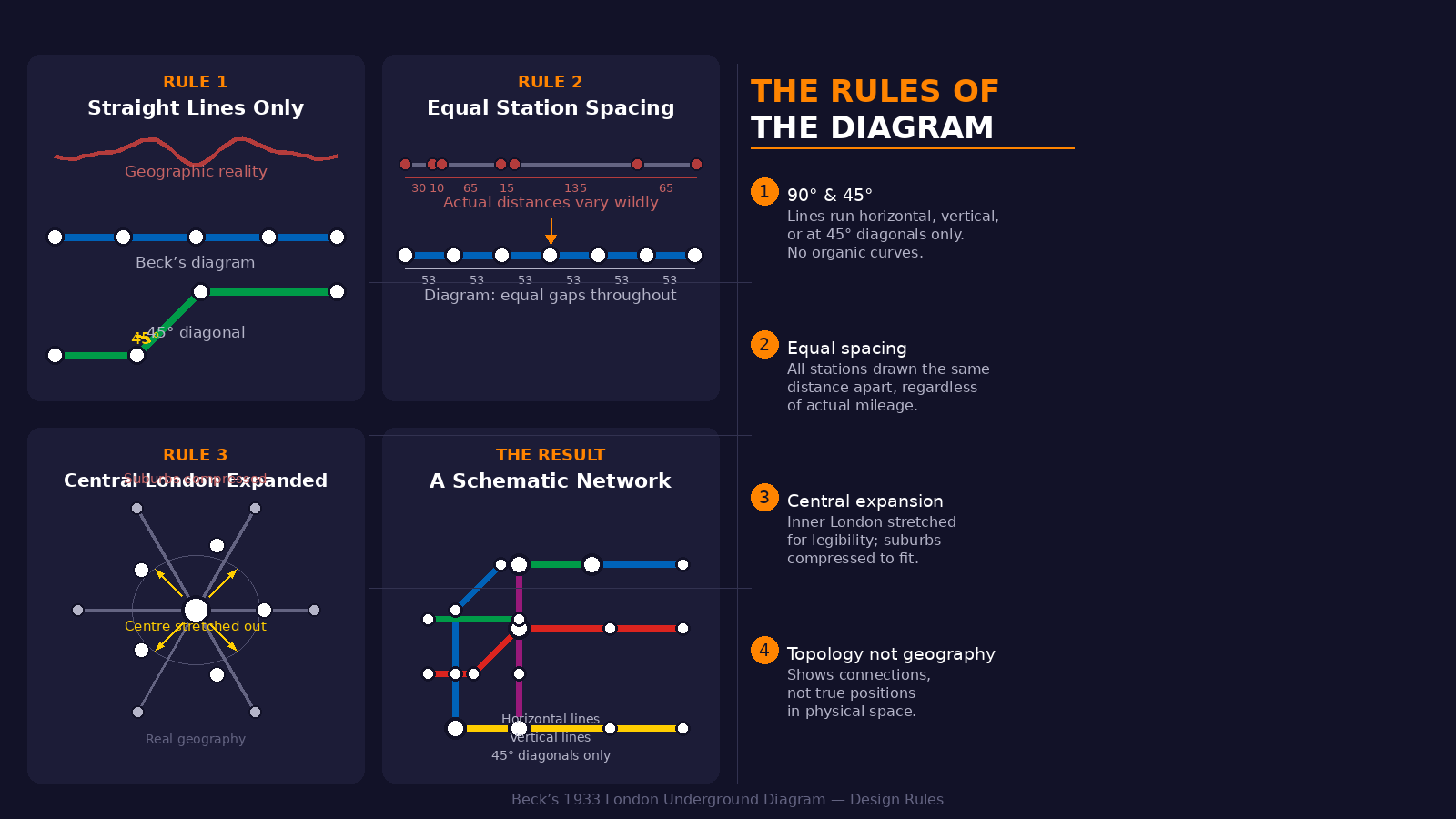
An illustration of Beck’s four design rules: straight lines at permitted angles, equal station spacing, central expansion, and topological representation.
Rule Four: Topology, Not Geography
Underlying all three of the specific rules above is a single, more fundamental principle: the diagram represents topology, not geography. Topology, in the mathematical sense, is the study of spaces defined by their connections and relationships, rather than by their metric properties. A topological map preserves which things are connected to which, and in what order, but discards the information about how far apart they are or what precise angle separates them.
This is why Beck’s diagram can be stretched, compressed, and rotated without losing its usefulness. The useful information, station A is connected to station B, station B is connected to station C, and you can change between Line X and Line Y at station D, is entirely preserved under these transformations. The useless information, station A is 1.2 kilometres from station B at a bearing of 247 degrees, is entirely discarded.
Beck’s insight was to recognise that the Underground was a topological object, not a geographic one. It existed in London, yes, but it did not really matter where in London it existed. What mattered was how its parts connected to each other. Once he had understood this, the design followed almost inevitably: represent the topology clearly, and the geography will take care of itself, or rather, the geography will become irrelevant, which is better.
The Interplay of the Rules
What makes Beck’s design so durable is not any single rule but the way the rules interact. The restriction of angles to horizontal, vertical, and forty-five degrees makes the diagram geometrically regular. Equal station spacing makes it metrically consistent. The expansion of central London makes it legible at the most complex point. The topological principle makes all of the above possible without sacrificing navigational usefulness.
Remove any one rule and the system begins to unravel. Allow arbitrary angles, and the diagram becomes visually cluttered. Allow variable station spacing, and the eye can no longer scan easily for stops. Represent central London at true geographic scale, and the most important part of the network becomes the most illegible. Attempt to preserve geography rather than topology, and you are back where the pre-Beck maps started: accurate, comprehensive, and useless.
There is something almost musical in the way Beck’s four constraints work together. Each one imposes a restriction that, considered in isolation, seems like a loss of information. Collectively, they produce something that feels not like a reduced version of reality but like a more useful one, a representation calibrated precisely to the needs of the person using it, rather than to the demands of the world being represented.
In the next post, we will look at how Beck’s diagram changed over time, how new lines were added, how the rules were tested and occasionally bent, and what happens to a design system when the network it represents keeps growing.
KEY THEMES IN THIS POST
- Straight lines and permitted angles: why restricting geometry creates visual clarity
- Equal station spacing: optimising for stop-counting, not distance
- Central London expansion: allocating page space by navigational need
- Topology not geography: the unifying principle beneath all four rules
- The rules as a system: how constraints combine to produce clarity
Leave a Reply